Visualization
Visualize ExG, orientation, spectral analysis and relative bandpower data in real-time by navigating to the Visualization page.
You can configure the visualization via the drop-down menus at the top of the Visualization page or by selecting Filters.
Settings include:
- Y-axis scale – change the range of the y-axis.
- 1 uV to 100 mV range.
- Visible channel count - change how many channels should be visible in the plot.
- 1, 2, 4, 8, 16 and 32 channels (depending on the connected device)
- Time window – change the time interval of the x-axis.
- 5, 10, or 20 second range.
- Record (see the Recording page).
- Event markers (see the software marker section in the Event Markers page).
- Filters.
- LSL integration (see the Lab Streaming Layer page).
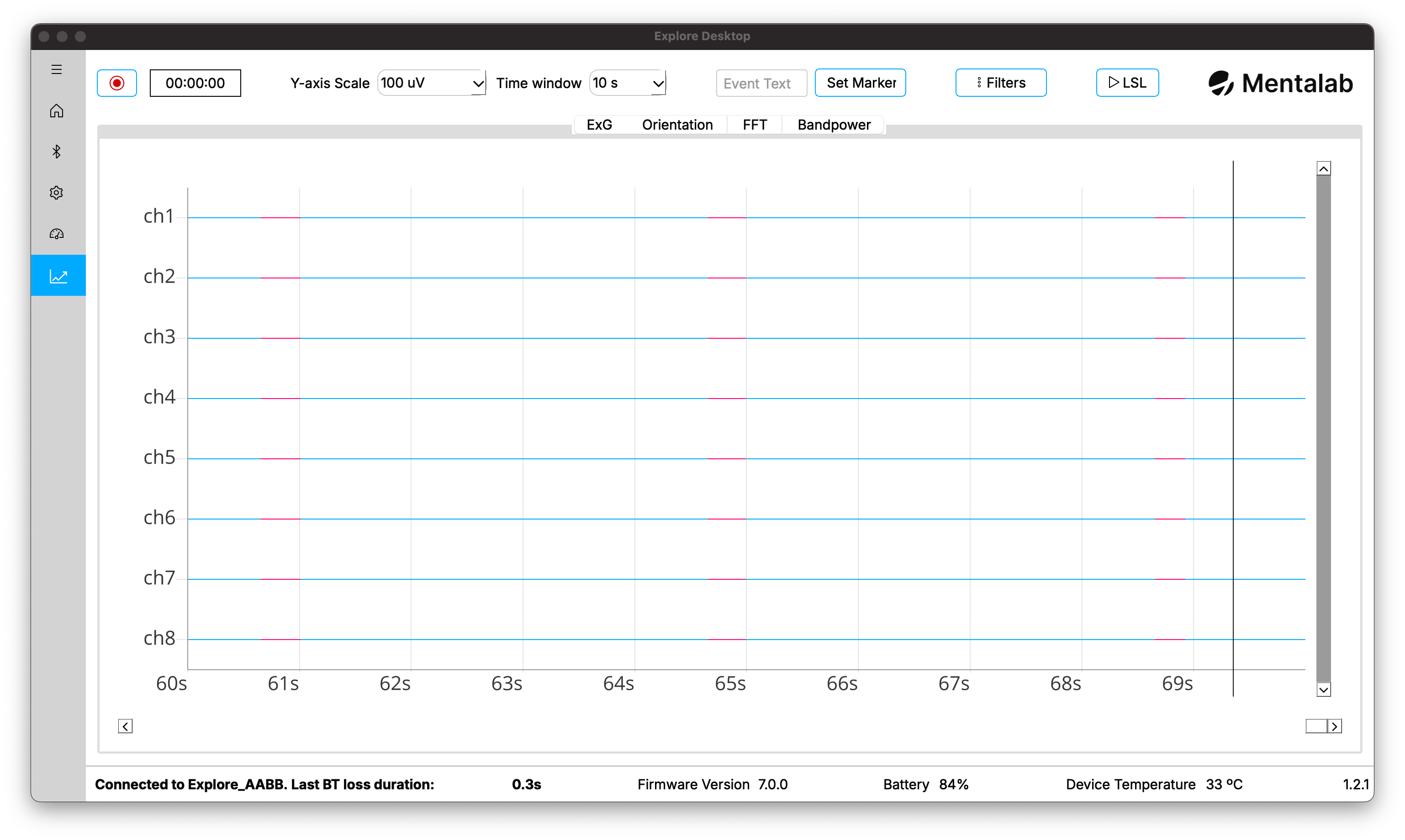
ExG
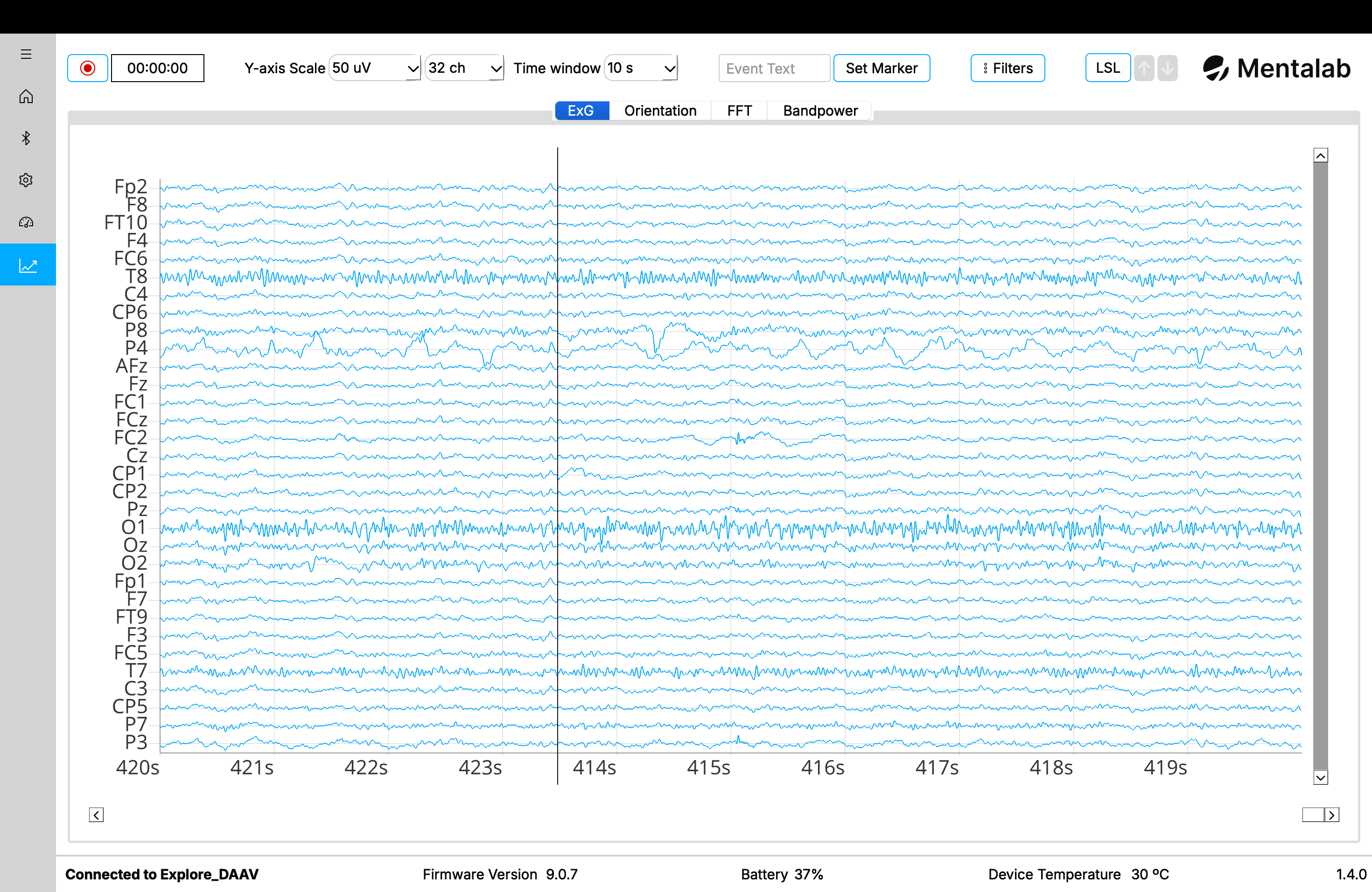
Real-time packet loss visualization
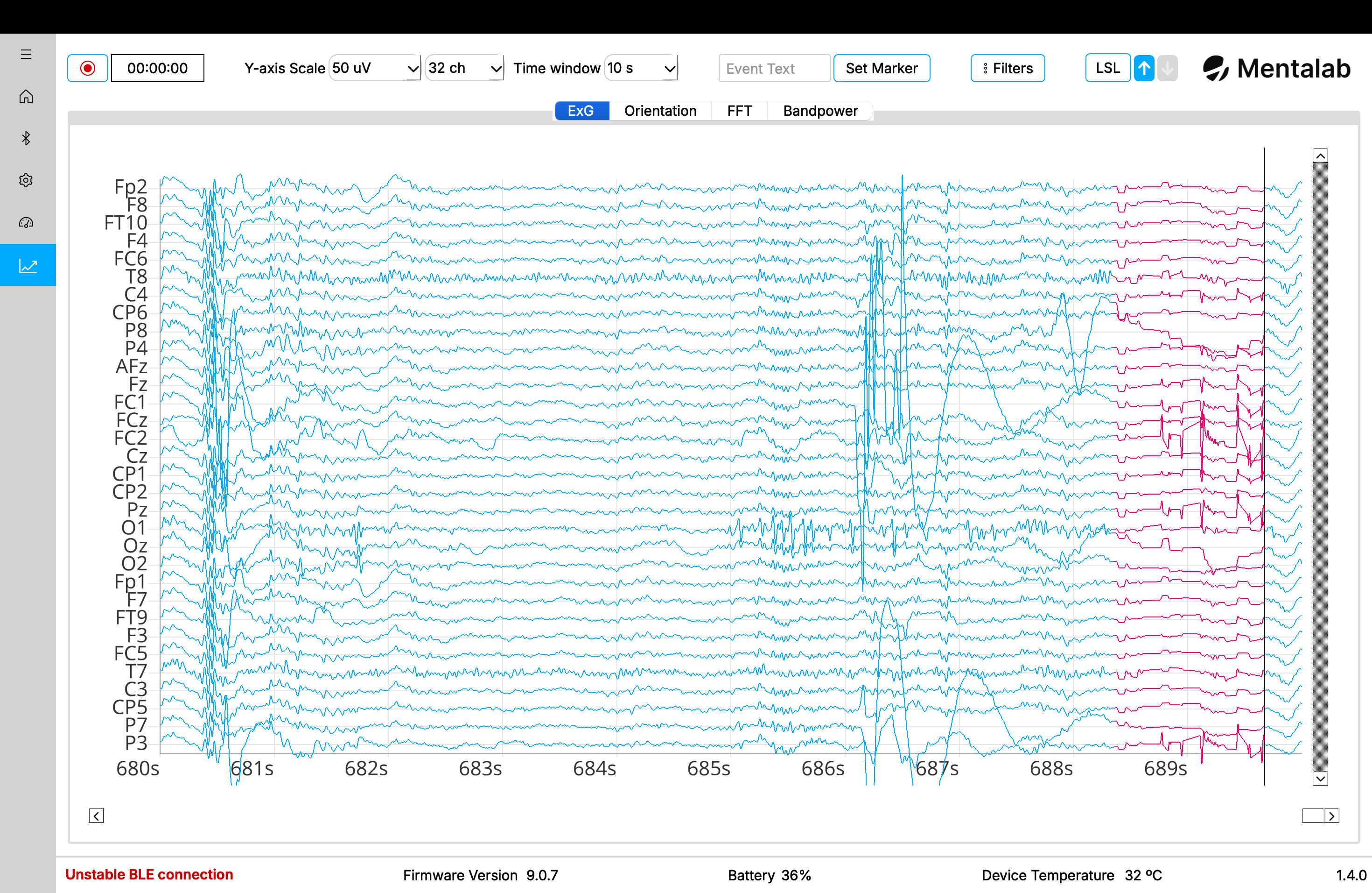
Indication of samples lost in seconds
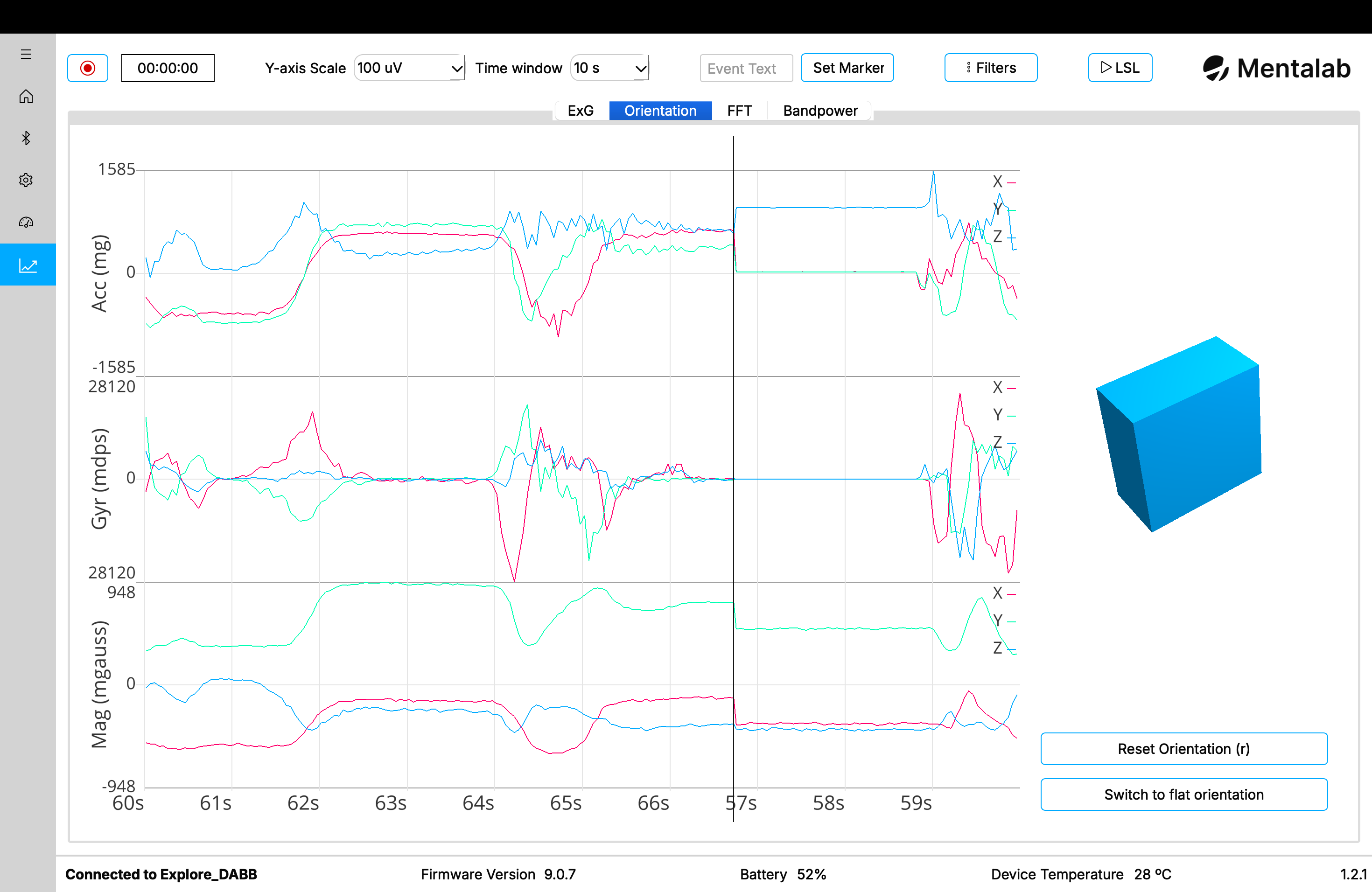
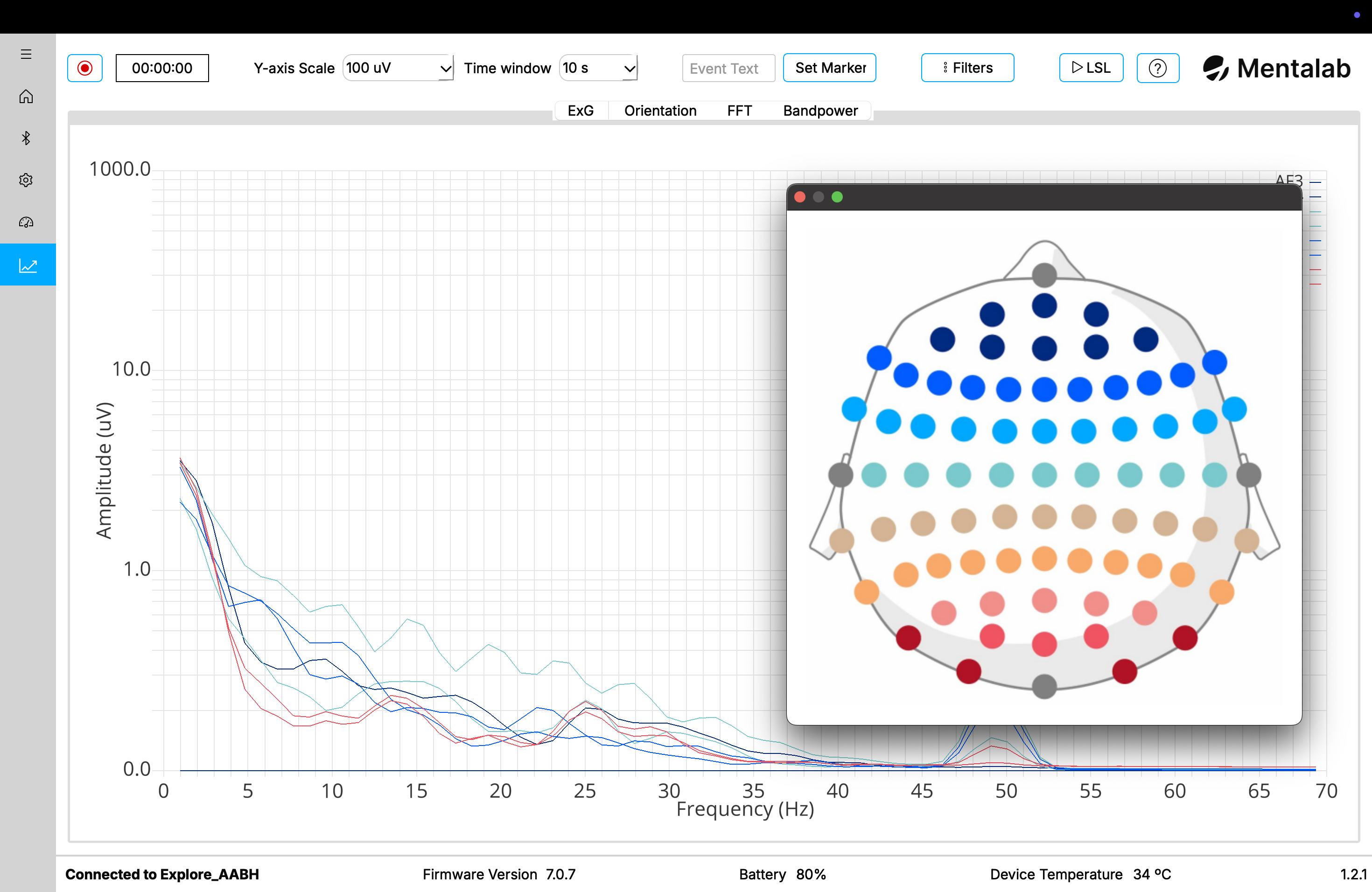
Motion sensors
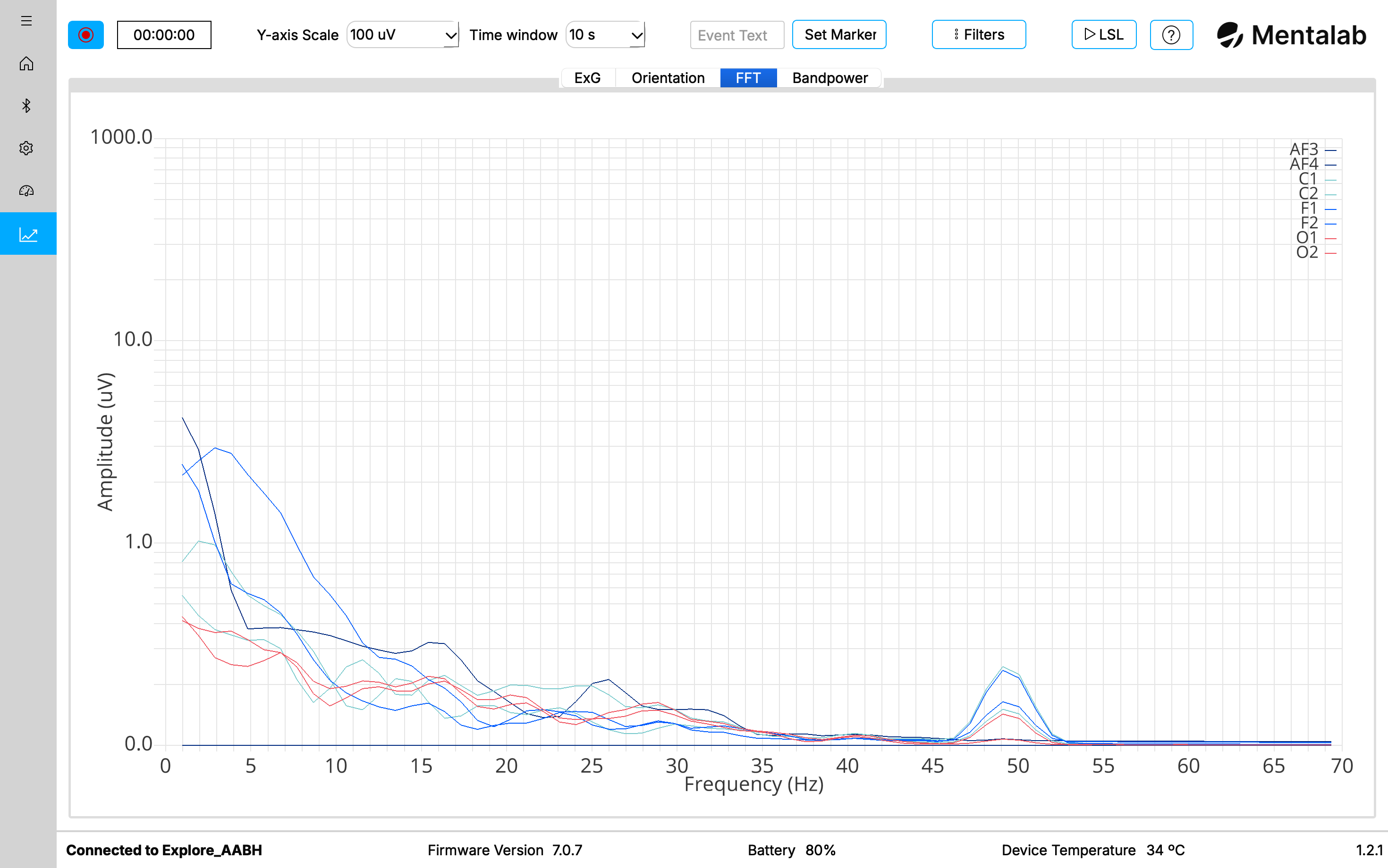
Spectral analysis
The spectral analysis plot is calculated using the FFT (Fast Fourier Transform). The colours of the channel lines map to positions on the head if standard positions are selected (using the 10-10 system). If a channel has no standard position name assigned, it uses a colour from a default colour scheme.
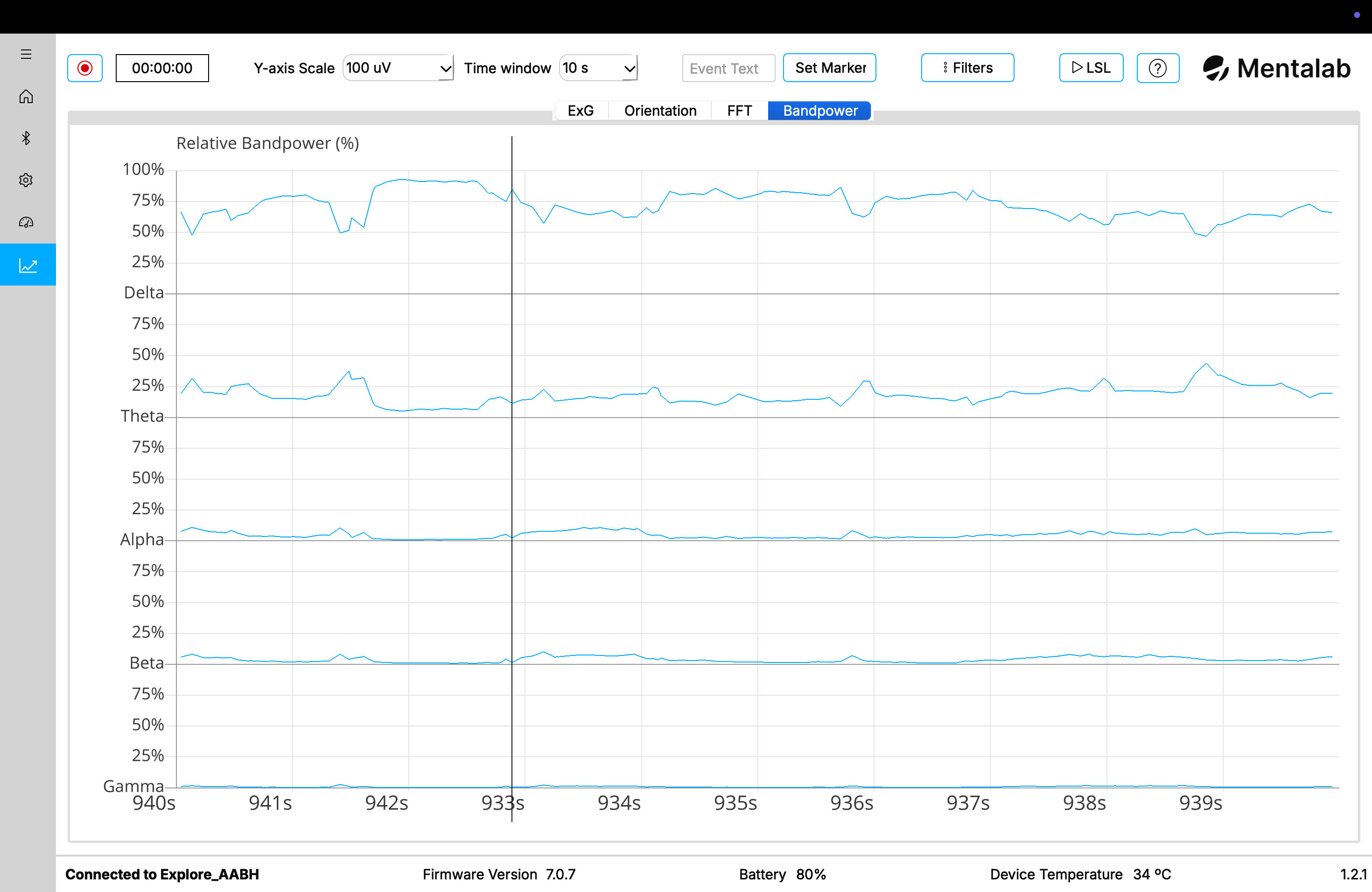
Bandpower over time
Filters
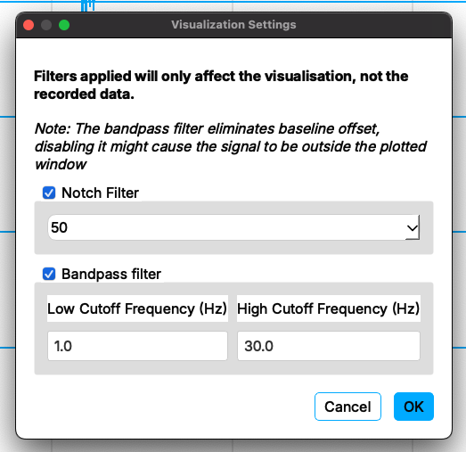
The Visualization page will prompt you to define your visualization filters. Explore Desktop will begin streaming data once you have selected your filters.
You will still be able to filter signals while the device is streaming. To do so, select Filters.
The following filters are available:
- Notch filter (band stop filter) – attenuates the power line noise at 50 or 60 Hz.
- High-pass filter – rejects signals with frequencies below this threshold, use the field Low Cutoff Frequency to set a high-pass filter
- Low-pass filter – rejects signals with frequencies above this threshold, use the field High Cutoff Frequency to set a high-pass filter
You can leave the low cutoff frequency field or the high cutoff frequency field empty to use a highpass or lowpass filter instead of a bandpass filter that utilizes both cut-offs.
Filters do not affect raw data, only what is visualised.
For more information or support, do not hesitate to get in contact at: support@mentalab.com